Announcing Tally: Use Python to crunch and visualise survey data
We are so happy with our new API that we gave it both a name and a mascot: Introducing Tally, the API for research data automation and visualisation.
In this post we are going to tell you how Tally allows you to RIM weight, create derived variables, clean and recode data with simple Python scripts (or do any data processing task you can think of), and how it can turn your websites into dashboards, produce Excel files and PowerPoint deliverables.

Dashboards
Tally both has a RESTful backend and a JavaScript front-end. The backend can read directly from survey software such as Alchemer, Qualtrics, SurveyMonkey, Confirmit and Unicom Intelligence, and the front end only requires a simple <div> to display interactive charts or entire dashboards (without iframes).
If the data behind the chart is live, so is are the results in the charts - even RIM weighting can be done on the fly. We call them zero-data-processing dashboards because derived variables, NETs, and weight schemes can be defined in the dashboard rather than in the data itself.
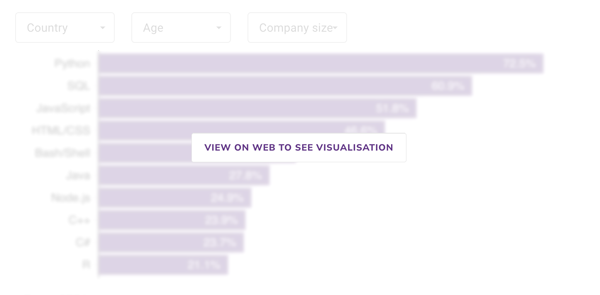
For example, here's what a single <div> tag can produce (results from a Pew Research survey on what people think of Twitter):
Survey data processing in Python
Tally has a powerful backend that can be scripted to do any data-processing task you can think of.
Let's say you need to create a weight column from your survey data, which is in a CSV file (also compatible with SPSS .sav files, Unicom .mdd/.ddf files, Confirmit, and others).
import tally
dataset = tally.DataSet(api_key=your_api_key)
dataset.use_csv('My survey data.csv')

scheme={
            'urban':{1:75.0, 2:25.0},
            'gender':{1:49.0, 2:51.0}
        }
result = dataset.weight(name='Gender and urban',
                        variable='weight_c',
                        unique_key='resp_id',
                        scheme=scheme)
That's all there is to it. Tally's RIM weighting algorithm supports advanced features such as different schemes for different cuts of the data (e.g. one for England, another for Scotland), live weighting of dashboards, a report that shows the weighting efficiency, max factors used, iterations required and so on.
PowerPoints and Excel
Tally can also mass-generate PowerPoint files and Excel tables. Here is a script that loops through answer codes in a variable called locality and produces one PowerPoint file for every answer (e.g. "Rural", "Urban").
codes = dataset_sav.meta(variable='locality')['codes'].values
texts = dataset_sav.meta(variable='locality')['texts'].values
for index, code in enumerate(codes):
    dataset_sav.build_powerpoint(filename='powerpoint_output/{}.pptx'.format(texts[index]),
                        powerpoint_template='pptx_templates/Datasmoothie_Template.pptx',
                        x=['q1', 'q2', 'q3'],
                        y=['gender', 'ethnicity'],
                        f={'locality':[int(code)]}
                        )
The script takes a ready-made, branded PowerPoint template, and populates it with Excel charts using the colour scheme you set in the template.
Excel tables can similarly be mass produced, allowing users to automatically generate and email tables to stakeholders at certain intervals.
❤️ Liked this content?
📣 Share it with your fellow data geeks on LinkedIn, Twitter or Facebook.
📚 Read more from the archive.
📊 Need help with your own data? Get in touch.
Subscribe to Unprompted Awareness by Datasmoothie
Join hundreds of survey data geeks getting our newsletter
straight to their inbox (it's free)