Use Python to create branded PowerPoint files in multiple languages from Unicom mdd/ddf files
Unicom Intelligence, formerly known as Dimensions, is one of the most popular survey data platforms on the market. One of the strengths of Unicom is its support for gathering answers and reporting in multiple languages.
In this post we are going to take a meta-data and data file from Unicom (mdd and ddf, respectively) and use them to quickly produce tons of branded PowerPoint presentations, in multiple languages, using Tally, the API for research data automation.
Get started with Python and Tally
First, install the Python client for Tally.
pip install datasmoothie-tally-clientThen we load up our Unicom files.
import tally
dataset = tally.DataSet(api_key=your_key)
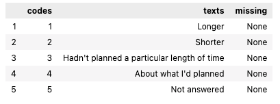
dataset.use_unicom('data/Example_Museum.mdd', 'data/Example_Museum.ddf')We can examine the meta data of a variable with the meta function. Our fictional client wants a report cut down by how long people stayed, so we use the variable long_short, which in English was "was your stay longer or shorter than planned?"
dataset.meta(variable='long_short')The output is
Produce the PowerPoints
We want to loop through the codes from the question long_short to produce a report on each group, according to how long people stayed in the museum. We also want each report to be available in English, Japanese and Spanish.
After we've had a look at the variables with the dataset.variables() command, we choose which ones we want in our PowerPoint files:
questions = [ 'before', 'biology', 'expect', 'gen_ent', 'oth_mus', 'plan','prefer', 'signs', 'similar', 'entrance', 'time_spent', 'desc_leave', 'when_decid',  'interest', 'long_short', 'distance'
]
crosstabs = [
 'gender', 'education', 'age', 'who_with', 'grp_type', 'group_org', 'resident'
]
Finally, we loop through three language codes, es-ES, en-GB, ja-JP and the five codes in long_short. Here, the '@' character means that we want the first slides to show totals, not just crosstabs.
languages = ['es-ES', 'en-Gb', 'ja-JP']
codes = dataset.meta(variable='long_short')['codes'].values
texts = dataset.meta(variable='long_short')['texts'].values
for lang in languages:
    for index, code in enumerate(codes):
        dataset.build_powerpoint(filename='powerpoint_output/museum-{}-{}.pptx'.format(lang, texts[index]),
                            powerpoint_template='pptx_templates/Datasmoothie_Template.pptx',
                            x=questions,
                            text_key=lang,
                            y=['@'] + crosstabs,
                            f={'long_short':[int(code)]}
                            )
Five responder groups, three languages, fifteen PowerPoint files
The end result are fifteen files. These have names like
- museum-en-Gb-About what I'd planned.pptx
- museum-es-ES-About what I'd planned.pptx
- museum-ja-Jp-About what I'd planned.pptx
- museum-en-Gb-Hadn't planned a particular length of time.pptx
- etc.
So, we've produced one file for each group of visitors in three languages.
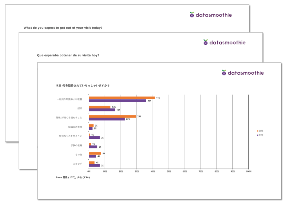
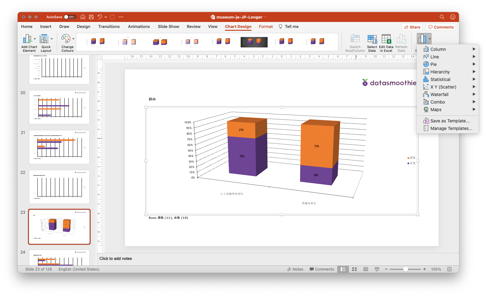
Each PowerPoint file has 128 pages with charts, so that's a total of almost two thousand charts you didn't have to create by hand.
❤️ Liked this content?
📣 Share it with your fellow data geeks on LinkedIn, Twitter or Facebook.
📚 Read more from the archive.
📊 Need help with your own data? Get in touch.
Subscribe to Unprompted Awareness by Datasmoothie
Join hundreds of survey data geeks getting our newsletter
straight to their inbox (it's free)